Project:
Redesigning a free music player app to promote freemium to premium upgrade.

I researched and designed the vibly app from a fabricated company’s problem statement. I also modified the app for free users as well as adding transition periods for free to paid user interaction.
My Role
UI/UX Designer
Team
Sammi Wu
Duration
October - November 2022 (90 Hours, approximately 2.5 weeks)
Tools
Figma, Google Drive
Project Overview
A startup company's strategy was to first build a user base by offering a free product and then evolve the feature set so they could monetize on a premium (paid)product. They now need to design an experience that will allow users to subscribe and pay a monthly fee.
From my research, I found that many freemium to premium people are much more loyal to apps they pay for. Since Vibly has formed a free user base already, there is an emphasis on transitioning these folks to desire paying for previously free features. In order for this to be appealing, there needs to be an addition of features, rather than a mass removal. I proceeded to research and analyze a few companies that have had a similar use progression.
Competitive Analysis
Through this competitive analyses I found the features that I wanted to include as well as what other companies value. While some music apps allow the user to stay free for longer, others prioritize onboarding and upgrading to the premium version much more. Overall, there is a large similarity between what features users value and consider when upgrading.

I chose to define the user flow of logging into Vibly to showcase

Exploring Solutions
The Solution
After running multiple interviews and ideations, I found created Vibly, a music player app that performs this transition from freemium to premium. Allowing users to use the app for free/free premium trials, and transitioning them to paid services at different tiers.
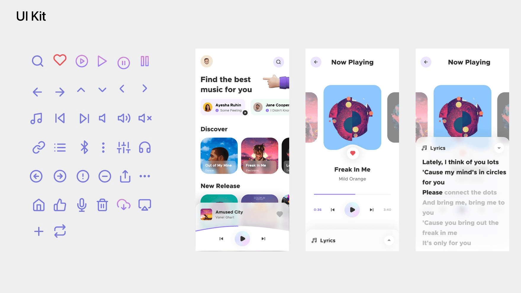
Due to time constraints I had to decide between sketching ideas or going straight into wireframes. These wireframe’s ideas were expanded upon and built out from the project’s original layout; however, the login, advertisement and premium screens were crafted by myself.

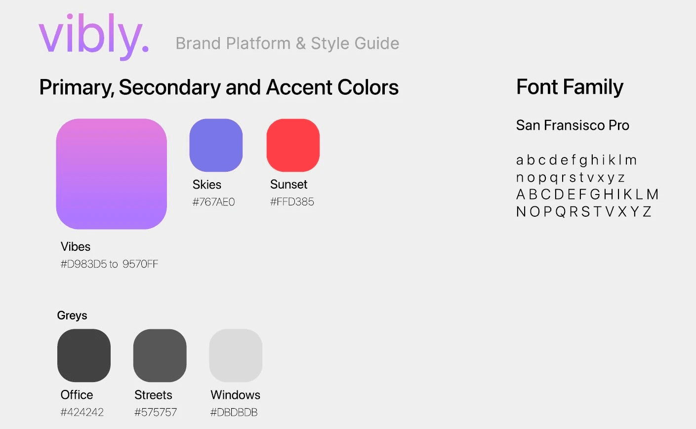
This style guide is based around the name vibly. A laid back color scheme similar to a sunset with a UI design kit that mimics simplicity and clean lines.
Premium Buy Screens
Consistent reminders to transition to the premium function. Allows the users to choose if they want to subscribe or see the promotion content.
Limitation Screens
Adding in advertisements and limiting the ability to use the app without a premium plan. Allowing for opportunities to upgrade to premium services.


This was the first round of high fidelity screens. After interviewing a few participants, I found that users would ask if there was a way to go back to upgrade pages. This evolved into the settings page being created, since it seemed like users wanted the extra feature. A drop down menu for a few key premium features was also added to make the upgrade more appealing.

Usability Testing
Five interviews were conducted to test the usability of the wireframes/prototypes for flow of the freemium to premium features.
Through user interviews three prominent characteristics were identified:
Clarity
Users noted that the app had a clear distinction between the free and premium features. While the free app had more pop up features to promote premium plans, the premium feature felt more smooth and clutter free.
Aesthetics
There was an overwhelming appreciation for the UI of the app. The users thought that synchronicity between the brand name and the app aesthetics was what they hoped for when opening the prototypes.
Familiarity
The app was seen as a familiar backdrop to the freemium to premium route. The way the app led the user to a premium purchase path was easy to follow and recognizable. There were no hoops to jump through in order to upgrade or stay as freemium.
Final Visual Design
For the final high fidelity wireframes I allotted time to iterate on the mockups and clean up the usability. Overall, the final visual design was created with the final user research in mind, and so a few changes were implemented (back buttons, color opacities, screen sizing and the addition of light/dark mode). The focus was put upon the purchasing screens and advertisement system, with visual coherence throughout the entire flow.
*Due to time constraints a prototype was not created.
