Project:
Developed and formulated the foundational framework for an educational app, pioneering the initial prototype iteration.
A social impact IT consulting firm developing an education and play-based app, with special focus on boosting STEM engagement amongst African-American girls.
My Role
Product Designer, UI/UX Designer
Team
Sammi Wu, Hannah Degruise, Tyrell Angeles, Vanessa Wang
Duration
July - August 2023 (40+ Hours, approximately 6 weeks)
Tools
Figma, FigJam, Miro, Slack, Google Drive
This company had done prior research for this project, resulting in constraints that our design team would work to incorporate:
A mermaid theme.
Play-based learning to integrate STEM skills.
Integration of a smart device to aid in education.
Then how might we…
...keep children engaged while actively learning STEM skills?
...design for two user groups, parents and children?
...incorporate themes and tools flagged as necessities?
How do we research and design moving forward?
1. competitive analysis
2. storyboarding
3. journey mapping
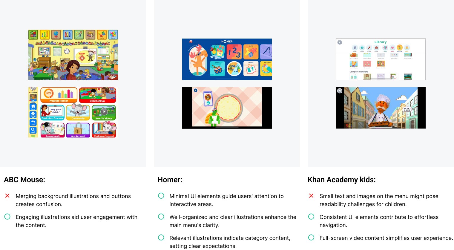
Given the user research and feedback from the company's initial test group, our team felt it best to identify competitors and map out the journey we wanted to guide users through. We conducted a comprehensive competitor analysis of online learning apps tailored for children and adults. This analysis aimed to extract insights that could ignite the design for our user interface.

What are competitors doing and how do we draw inspiration from them?
Emphasize clarity in user journey, allowing users to easily continue onto their next game/lesson.
Incorporate bright, bold color palettes that catch the attention of the user.
Create a reward system to promote continued use of apps.

What does the user's learning experience entail?
1. finding the app/product and building curiosity
2. the ability to track children's' progress
3. prompt engaging activities that both children and parents collaborate on
4. utilizing pairable devices for assistance through app content
The storyboard helped us clarify user goals and create detailed user stories for the product. Our first step was to make this storyboard a crucial part of outlining the user's experience, mapping out both child and parent journeys.
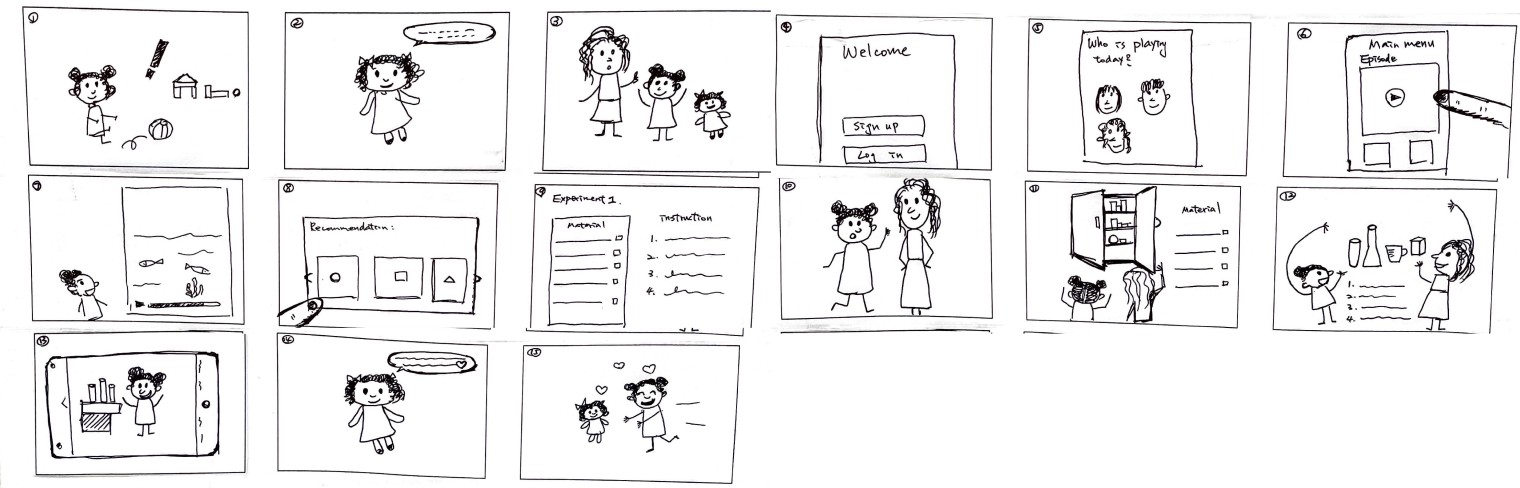

How should we anticipate users will navigate the app?
The storyboard helped us clarify user goals and create detailed user stories for the product. Our first step was to make this storyboard a crucial part of outlining the user's experience, outlining both child and parent journeys.

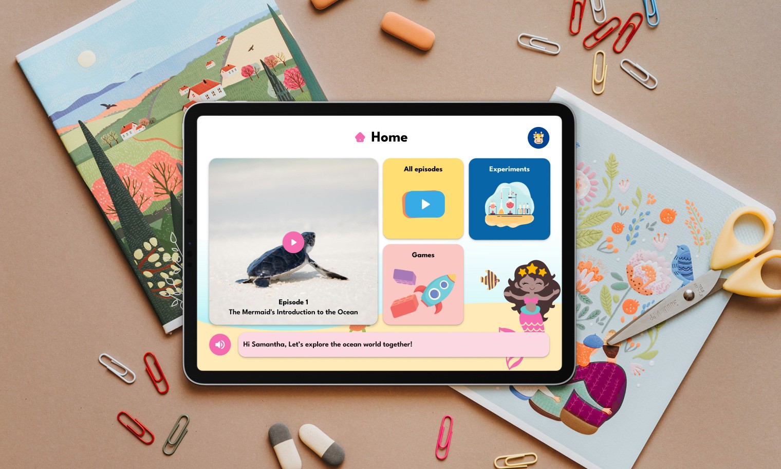
For a smooth children's experience, we implemented a straightforward hierarchy architecture. This design ensures that content can be easily reached from the main menu with just a few taps, simplifying navigation and improving the app's user-friendliness for it's young audience.

Now what do we want it to look like?
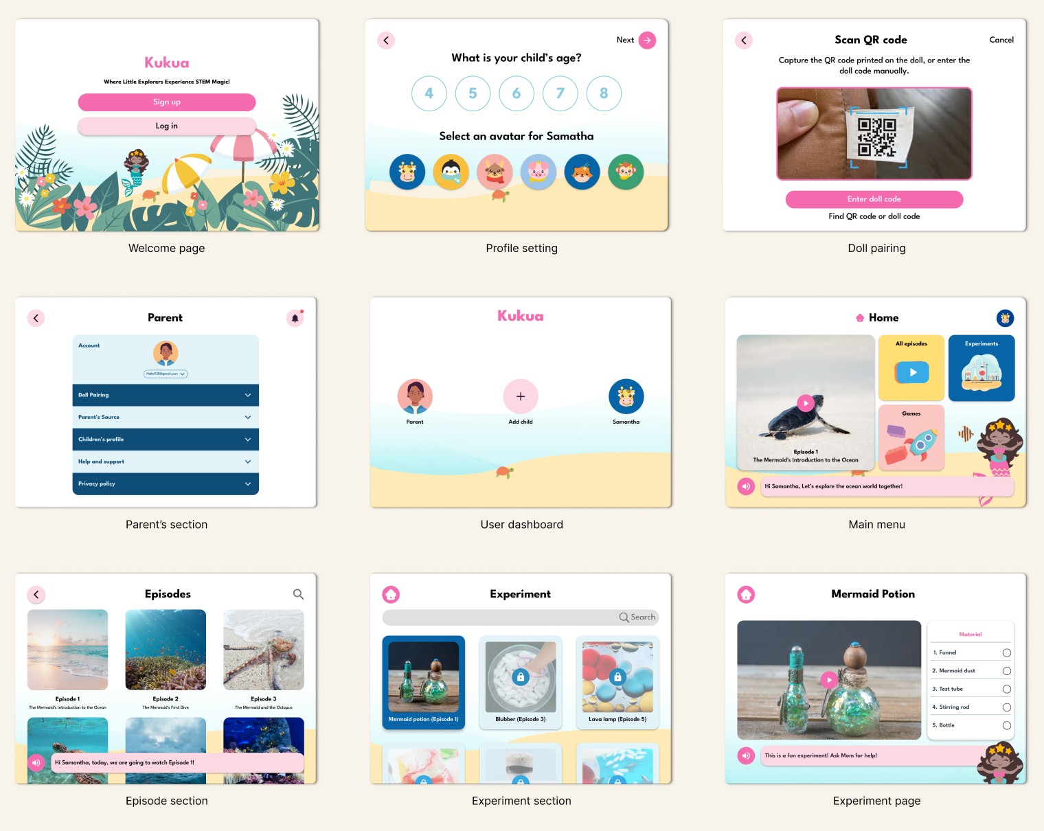
Through consultation with the company, we crafted a style guide that our team thought best suited the app. Since there was no prior branding, we presented multiple style guides so the client could narrow down the app's direction. From there we were able to mockup some key screens/flows, resulting in the first prototype iteration to be tested.
Our team created a comprehensive style guide to maintain a consistent and cohesive design across all screens. This foundational document ensured a seamless, engaging user experience throughout the app by providing a unified framework for visual elements.

Due to time constraints, our team utilized the storyboards to create our first lo-fi mockups. This was also paired with a usability test script, which the company would use to gain feedback for our next iteration.

What did we learn from the first iteration?
1. the purpose of the app and many features were confusing for both adults and children
2. incorporation of distinctive action items and intentional pathing
3. visual appeal attracted engagement and focus
4. tablet perspective is a necessity for optimal adolescent learning